Friday, December 28, 2012

Data link roundup (week of December 28, 2012)

The week's top data analysis links...

HOW DID THAT GET FUNDED?

Today in topics that make you wonder why one person's research gets funded, but yours doesn't... CUNY researchers find a statistical link between reality television watching and tanning bed usage. (Insert Snooki joke here...)

From the abstract:
RESULTS:
Those who did versus did not watch reality TV beauty shows used tanning lamps (12.9% vs 3.7%, P < .001) and tanned outdoors (43.3% vs 28.7%, P < .001) at significantly greater percentages. Significant predictors of tanning lamp use included watching reality TV beauty shows (odds ratio [OR] 2.58, 95% confidence interval [CI] 1.11-6.00), increasing age (OR 1.17, 95% CI 1.04-1.32), and female sex (OR 10.16, 95% CI 3.29-31.41). Significant predictors of outdoor tanning included watching reality TV beauty shows (OR 2.11, 95% CI 1.33-3.34)
CONCLUSION:
Watching reality TV beauty shows is associated with both tanning lamp use and outdoor tanning. Dermatologists should consider discussing the potential harmful aspects of tanning beds and outdoor tanning, especially with their patients who watch reality TV beauty shows.
While, as a sociologist, I understand the social construction of reality and the influence of mass media as an agent of socialization, I also understand the difference between correlation and causality. Judging by the conclusion, I suspect the authors might need a refresher course?


GENERATION GAP IN GOVERNMENT BUDGET PRIORITIES

This week the Pew Research Center released a report "The Big Generation Gap at the Polls Is Echoed in Attitudes on Budget Tradeoffs" based on results from the general public survey.
Source: Pew Research Center


OLD RELIGION

Pew also released a report on the Global Religious Landscape, including geographic distribution of populations by religious affiliation, and information about the age structure of the world's major religious groups.

Source: Pew Research Center


BEST CHART OF THE WEEK

The most cited works in Sociology...
Thanks to scatterplot.
Source: Scatterplot


Thursday, December 27, 2012

Survey says?

If you've ever worked with survey data, this cartoon is for you...
Source: Calvin and Hobbes by Bill Watterson, August 23, 1995

Friday, December 21, 2012

Data link roundup (week of December 21, 2012)

The week's top data analysis links...

BOOKMARK THIS TUTORIAL

The "Getting started with charts in R" tutorial from FlowingData.com is the most bookmark-worthy post of the week.


BIZARRE ECONOMIC INDICATORS

Thanks to Urban Demographics for pointing out this link to three dozen of the most bizarre economic indicators ever proposed by economists. Here are just a few:

  • High Heels Index
  • Mosquito Bite Indicator
  • Plastic Surgery Indicator

AMERICAN COMMUNITY SURVEY GOES DIGITAL

This week the U.S. Census Bureau announced an online response option for the American Community Survey. For more information on the research that led up to this decision, see their published work on internet data collection.


BEST CHART OF THE WEEK

Would that this were not a national headline this week, but the New York Times' map of the National Rifle Association's letter grades for members of Congress is simple to understand, and thus a powerful infographic.

NRA grades each House and Senate member with a letter grade from A to F, signifying their support for or opposition to gun access.
Source: New York Times

Friday, December 14, 2012

Data link roundup (week of December 14, 2012)

The week's top data analysis links...

JOB MARKET STILL SOUR FOR SOCIOLOGY PhDs

Neal Caren compiled the number of job postings (containing the words "Assistant Professor" and "Tenure Track") in the American Sociological Association job bank each month from January 2007 - present. His findings: Those who are looking for a job in 2012 have more opportunities than those in 2009 or 2010, but postings are still down from their pre-recession levels.
Source: scatterplot

MOVIN'

After reaching the lowest mover-rate on record in 2012, the U.S. population appears to be on the move again, according to a new geographic mobility report released this week by the U.S. Census Bureau and based on data from the Current Population Survey.

According to the report:
About 36.5 million people 1 year and older moved, an increase from the 2011 estimate of 35.1 million. In 2012, the majority of people who lived at a different residence 1 year ago moved within the same county (64.4 percent).
Source: U.S. Census Bureau

SHIFTING SUPPORT

Despite increasing support for gay rights, on average, nationwide the Pew Research Center notes that substantial regional variation persists:
Source: Pew Research Center

BEST CHART(s) OF THE WEEK

The Business Insider illustrates that population size matters by comparing the trend in driving (as measured by vehicle miles traveled) with and without population adjustment. Without the adjustment, there appears to be a small, recession-oriented drop in driving. With the adjustment, a longer-term, lower-driving trend appears to be underway.

Miles driven (without population adjustment):
Source: Business Insider

Miles driven (adjusted for population size):
Source: Business Insider


Tuesday, December 11, 2012

Nation's largest metros growing, but reasons vary

America's biggest metropolitan areas are growing, but for very different reasons, according to a new report from the U.S. Census Bureau.

Among metropolitan areas of 2.5 million people or larger, only Detroit lost population between July 1, 2010 and July 1, 2011. The other twenty large metro areas all saw population growth. However, drivers of growth varied widely among metropolitan areas.
Source: U.S. Census Bureau

DRIVERS OF GROWTH:

Population change occurs because of births, deaths, and migration. Births and deaths, collectively, are referred to as "natural increase."

At the state, county, and local level, migration can measured in a variety of ways, but is often estimated in terms of net international migration (those moving into, or out of, an area from abroad) and net domestic migration (those moving into, or out of, an area from another area within the same nation).

NET DOMESTIC OUT MIGRATION IN THREE LARGEST METROS:

In the nation's three largest metropolitan areas, New York, Los Angeles, and Chicago, population grew as a result of births, longer life expectancy, and international migration.

However, net domestic migration estimates show that more residents moved out of these areas to other parts of the United States than moved into these areas between 2010 and 2011.

DON'T MESS WITH TEXAS:

The largest metropolitan areas in Texas, however, showed an entirely different pattern, acting as magnets for migration from other parts of the United States.

The Dallas-Fort Worth and Houston metro areas both grew by more than 100,000 during the year with 20 percent or more of that growth coming from net domestic migration.

SUNSHINE STATE:

Miami and Tampa, Florida's largest metropolitan areas, were also net-attractors of residents from other parts of the U.S. Miami showed fairly even population growth across all categories (20,400 natural increase, 35,200 international migrants, 36,200 domestic migrants) for net population growth of more than 92,000.

While Tampa attracted more than 27,000 domestic migrants, net international migration was less than 7,000, and an aging population resulted in net natural increase of only 2,300, the lowest of all 21 large metropolitan areas in the report.

GOLDEN STATE:

As noted above, more residents moved out of the Los Angeles metro area than moved in between 2010 and 2011. However, other large metros in California fared better. As a result of net domestic in-migration San Francisco gained 5,900, Riverside-San Bernardino gained more than 15,000, and San Diego grew by 800.


Methodology and Source Notes:
The figures shown above are from the U.S. Census Bureau Population Estimates (vintage 2011). Additional information on patterns of migration can be found in the Current Population Survey report on geographic mobility.

Monday, December 10, 2012

Counting empty calories from alcohol

While New York City enacts new regulations to curb consumption of empty calories in sugary soft drinks, a new report from the CDC suggests that alcoholic beverages may pose a similar empty-calories health problem.
From the report:
Although the risks of excessive alcohol consumption in terms of injury and chronic disease are well known, less is known about the calories consumed from alcoholic beverages. As with calorically sweetened beverages, alcoholic beverages are a top contributor to caloric intake but provide few nutrients.
Analysis is based on information collected in a 24-hour dietary recall interview conducted as part of the National Health and Nutrition Examination Survey (NHANES) between 2007 and 2010. NHANES sample size is approximately 10,000, and analysis of alcohol consumption focuses on respondents age 20 and older.

CDC finds that on any given day one third of men and nearly twenty percent of women consume alcoholic beverages. On average, adults in the U.S. consume an average of 100 calories* worth of alcohol per day. Men, on average, consume three times as many calories from alcoholic beverages as women do. Across both sexes, those who consume alcohol often do so in larger-than-recommended quantities:
...almost 20% of men and 6% of women consume more than 300 calories from alcoholic beverages, which is equivalent to 2 or more 12-ounce (oz) beers, more than 2½ glasses of wine (12.5 oz), or more than 4.5 oz of spirits.
The study authors note that "on a given day, consumers of alcoholic beverages obtain approximately 16% of their total caloric intake from alcoholic beverages" which is higher than the dietary recommendation that no more than 15 percent of calories come from discretionary solid fats and added sugars.

Avg. calories from alcoholic beverages per day among U.S. adults age 20+,
by sex, age, and type of alcohol (2007-10)

Source: CDC

With respect to age and sex differences, CDC finds that most alcoholic-beverage calories consumed by men are from beer. Among women, calorie consumption is evenly distributed across beer, wine, and liquor. Across both sexes, consumption is highest in the 20-39 age group and lowest among those age 60 and older.


*Note: According to CDC, one beer is approximately 150 calories, one glass of wine is approximately 120 calories, and 1.5 ounces of liquor is approximately 100 calories.

Friday, December 7, 2012

Data link roundup (week of December 7, 2012)

The week's top data analysis links...

METRO COMPARISONS

A new map tool from Brookings shows the relative economic strength and rate of recovery for metropolitan areas around the world, and includes data from 1993-2012.


20 YRS OF TXT

The Economist reminds us that this week text messaging turned 20. (Another year and drunk-texting is legal?)
Source: The Economist


CAN'T TEXT AND DRIVE

RCLCO delivers more evidence that Millennials are less auto-centric than other generations of Americans.

The study authors surveyed residents in the 20 largest metropolitan in the U.S. to "gauge current attitudes toward auto use and ownership." According to study authors:
The survey results show significant continued devotion to the auto—over 60% of all respondents answered affirmatively when asked whether they own and need a personal automobile and could not live without it—but a substantial minority expressed a willingness to consider alternatives to auto ownership, such as relocation to other locations with improved public transit and car sharing.  Not surprisingly, the Gen Ys (born since the early 1980s), with their now well-known urban preferences, show considerable interest in these ideas. From a real estate development perspective, the impact of less auto usage, and by extension less on-site parking, can have a dramatic impact on development costs. Results from the RCLCO survey indicate that significant generational differences exist in attitudes toward car ownership. For example, Gen Y respondents indicated that they prefer not to own a car at a much greater rate than their counterparts in other generations—32% of responding Gen Ys do not own a car and do not need one, because they use public transit and/or alternative transportation. This is approximately twice the rate for Gen X and over three times the rate for older generations.
(Author's note: I suspect texting is the driving force behind this shift.)


BEST CHART DATA OF THE WEEK

This week the U.S. Census Bureau released 5-year American Community Survey data for 2011. The FactFinder2 application offers online mapping capabilities, as illustrated by the Florida and New York teen birth rate maps shown below.
Source: Author's compilation of data from the FactFinder2 mapping tool
The maps represent the proportion of females age 15-19 who report having a birth in the past 12 months when questioned during the 2007-2011 ACS survey period.

Thursday, December 6, 2012

How (not) to respond to reviewer comments

Having been on both sides of the reviewer/reviewee spectrum, I found "Addressing Reviewer Comments" from PhD Comics particularly amusing:
Source: PhDComics.com

Saturday, December 1, 2012

Bloomberg gets birth headline wrong

In an article published yesterday, and based off of birth rate trends reported by the Pew Research Center, Bloomberg Businessweek reported that U.S. births are at their lowest since 1920.
Source: Bloomberg Businessweek

Not so fast...

The Pew analysis, based on National Vital Events records and American Community Survey data, found that the birth rate is at its lowest point on record in the United States. Pew's authors write:

The overall U.S. birth rate, which is the annual number of births per 1,000 women in the prime childbearing ages of 15 to 44, declined 8% from 2007 to 2010. The birth rate for U.S.-born women decreased 6% during these years, but the birth rate for foreign-born women plunged 14%—more than it had declined over the entire 1990-2007 period.1 The birth rate for Mexican immigrant women fell even more, by 23%.

Final 2011 data are not available, but according to preliminary data from the National Center for Health Statistics, the overall birth rate in 2011 was 63.2 per 1,000 women of childbearing age. That rate is the lowest since at least 1920, the earliest year for which there are reliable numbers.

The 2011 birth rate, indeed, appears to be the lowest on record. However, the U.S. population is three times larger in 2011 than it was in 1920 (105.7 million in 1920 compared with 311.0 million on April 1, 2011).

As a result of the two combined demographic forces, a growing population and a declining birth rate, the total number of births is still higher in 2011 (3,953,600) than it was in 1920 (2,777,000).

The chart, from CDC, illustrates this point. The darker blue line represents the total number of births, while the lighter colored line represents the rate.
Source: CDC
Births and the birth rate are not one and the same.

This might seem like an unimportant nuance, but consider the implications for school planning if the public is led to believe that five years from now there will be fewer children in Kindergarten than there were during World War I...

Friday, November 30, 2012

Data link roundup (week of November 30, 2012)

The week's top data analysis links...

ANALYSIS ADVENT

The Economist magazine posted its data analysis Advent calendar. Each day a new "most popular chart of the year" will be revealed.


PROLIFIC POTATO

It has long been suspected that the cultivation of potatoes played a starring role in the demographic transition by increasing nutrition and extending life expectancy. New estimates suggest that a quarter of "Old World" population growth from 1700 to 1900 can be attributed to the tuber.
Source: Library of Congress

TO SECEDE OR NOT TO SECEDE? (Actually, that's not the question...)

Despite widespread media hype about the post-election secession movement, and reports of nearly a million signatures collected across 60 petitions filed on the White House website, careful analysis of the data show that many of the signatures were the result of single individuals signing multiple petitions.

Once duplicates were removed, only 0.1% remained (about 300,000 signatures in a nation of more than 310 million people), according to results published by Neal Caren at UNC Chapel Hill.


BEST CHART OF THE WEEK

Things on a university website:
Source: xkcd

Wednesday, November 21, 2012

Facts about the Thanksgiving feast

Facts and figures for the fourth Thursday in November...

AND AWAY WE GO!

43.6 million Americans (about 14 percent of the total US population) will travel at least 50 miles from home over Thanksgiving weekend. This represents just under a 1 percent increase in total holiday weekend trips, compared with 2011, and is the fourth consecutive year of increasing holiday travel, according to a report released by AAA.

Auto travel accounts for the lion's share (90 percent) of those trips. Despite notoriously long lines at the airport, only 8 percent of holiday travelers plan to fly, and the remaining 2 percent will travel via train, bus, or other mode.

About half of long-distance travelers (those going 50 miles or more) will make a day trip of it. The other half will spend an average of three nights away from home.

Despite increased travel, people plan to spend less, with estimated travel costs ringing in just under $500 per traveler in 2012 compared with just over $550 the prior year.

FACTS ABOUT THE FEAST:

The average American consumes 13.3 pounds of turkey each year, according to data from the U.S. Census Bureau.

American farmers have raised about 250 million turkeys in 2012, with six top turkey-producing states accounting for nearly two thirds of the total.

With respect to traditional American Thanksgiving side dishes, U.S. growers produced more than 384,000 tons of cranberries, 550,000 tons of pumpkins, 672,000 tons of green beans, and a whopping 1,350,000 tons of sweet potatoes in the past year.

That said, even with a large domestic crop of sweet potatoes, the United States still imports $5.6 million dollars worth, or nearly half of all imported sweet potatoes, from the Dominican Republic.

HAPPY THANKSGIVING!

Thursday, November 15, 2012

Geography Awareness Week: Waterfront Property

This week we'll be celebrating Geography Awareness Week by highlighting unique spatial visualizations of data.

Image source and source notes: Counties are based on 2010 geography and historical populations are based on population estimates derived from decennial census data (1790-2010).
Point locations are based on population-weighted county centroids.
According to NOAA, today more than half of the U.S. population lives in a coastal county. Recent graphics from the U.S. Census Bureau put the proportion closer to one third.

Why are the two measures so different?

The answer is in how you define "coast."

The Census Bureau analysis, pictured above, defines a "coastal county" as any county in which a portion of the county's boundary is adjacent to an ocean. NOAA's analysis includes the Great Lakes in the definition of coastal. Densely populated areas, like Chicago, account for the difference in the two measurements.

Wednesday, November 14, 2012

Test your geography knowledge

This week we'll be celebrating Geography Awareness Week by highlighting unique spatial visualizations of data.

In honor of GIS Day, the highlight of Geography Awareness Week, I have a three geography games to share:

Test your knowledge of the states in the United States by placing them (correctly) on the national map:

Or go abroad and play one of the many geography games at Lizard Point maps which range from naming European capitals to identifying the provinces in Afghanistan and identifying the nations in South America.

And last, but not least, is The World's Geo Quiz Challenge from Public Radio International.

Please feel free to share your score(s) in the comment section!

Happy GIS Day!


Tuesday, November 13, 2012

Geography Awareness Week: Election Coverage

This week we'll be celebrating Geography Awareness Week by highlighting unique spatial visualizations of data.

The 2012 election was marked by punditry, partisanship, and polling. But the election also allowed geo-spatial patterns a moment in the 24-hour news cycle spotlight.

Here are few striking visualizations from the election coverage:
Dr. Vanderbei at Princeton looks at changing patterns in party preference in presidential elections since the 1960s. Blue represents Democrat counties, red represents Republican, and green is all other.
Election results in 2012
Image source

Similarly stunning are the New York Times interactive graphics of the election results, which represent factors ranging from the size of each candidate's lead to the shift in votes between 2008 and 2012.

Taking the visualizations in a different direction, the population weighted cartograms published at the University of Michigan are pretty neat. They show a nation much less divided than the to-scale red-state/blue-state maps do.

Sadly, a flurry of racist tweets greeted the election results. The southeast had the highest proportion of racist tweets as a share of overall tweets on election night, as measured using a location quotient ratio.
Image source

So we have evidence that the United States is a very divided nation...
... or is it?
Image source

Sunday, November 11, 2012

Geography Awareness Week: Charting population density along America's highways

This week we'll be celebrating Geography Awareness Week by highlighting unique spatial visualizations of data.

The U.S. Census Bureau produced a series of graphics that show population density along some of the nation's most and least heavily populated transportation corridors.
Image source and source notes: Population density is based on average population density within 5 miles of the highway, in 2-mile increments, using 2010 block group centroids and 2010 Census population counts.
According to the Census Bureau:
Running from Los Angeles to Jacksonville, I-10 passes through 8 states and several major cities and traverses the 3rd largest population among the country's interstate highways. Population density within 5 miles of the interstate show several lengths with very low population density, including stretches between El Paso and San Antonio. Selected cities along the route are labeled, for reference, with cities of 250,000 or more shown in bold and with filled circles.
For comparative purposes, the Census Bureau provides a similar population density chart for the I-90 corridor, which runs along the northern part of the United States from Seattle to Boston. The highway, despite connecting Seattle, Chicago, and Boston, passes through some of the least densely populated areas in the nation.

Friday, November 2, 2012

Link roundup (week of November 2, 2012)

The week's top data analysis links...

SWEET CORRELATION

Sally Raskoff, in her post titled "A Tasty Correlation" explores news headlines touting the correlation between chocolate consumption and Nobel Prize winners. (If only it were that simple!)

Using the chocolate example, Raskoff illustrates the difference between correlation and causality in an easy-to-understand summary of one of the basic principles of statistical research. The article would be a useful reading assignment for introductory Statistics or Sociology students.


TRACKING SANDY

The New York Times, as usual, provided beautiful and informative illustrations of the magnitude of damage left in the wake of hurricane Sandy.
Source: New York Times
A more detailed screen capture of the power outtages can be seen on FlowingData's post.


Thursday, November 1, 2012

Dia de los Muertos: Life expectancy trends

Historic New England cemeteries are a bit different than cemeteries in many other states in the U.S. in that they were often family plots, on local farms or homesteads, and not in a church yard.
Early Puritans rejected churchyard burials as they rebelled against other "papist" practices, as heretical and idolatrous. Instead, many 17th century New England towns set aside land as common community burial grounds. Headstone images from this period also reflect the rejection of formal Christian iconography in favor of more secular figures, such as skulls representing fate common to all men.
Source: National Park Service
As a result, a hiker often stumbles across tombstones on a typical trek in southern New England. These tiny graveyards provide a tangible record of the region's demographic history.

One of the most striking details, aside from the sizable share of persons who passed away before their fortieth birthday, was that so many tombstones were marked in years and months. In some cases, life was marked in years, months, and days.
Aged 23 years 10 months & 25 days
This is clear physical evidence of a phenomenon clearly understood by demographers: life expectancy was short at the turn of the last century.

There is, too, the startling reminder of high infant mortality in the 1900s New England. One in ten children did not survive to reach their first birthday.
Infant: age 3 months & 3 days
Pregnancy was also a dangerous condition. According to the CDC, "For every 1000 live births, six to nine women in the United States died of pregnancy-related complications." Today those trends have been sharply reversed. Across most populations infant mortality claims fewer than 7 deaths per 1,000 live births, and maternal mortality has declined to 0.1 per 1,000 life births.

But despite these dark statistics, the gravestones mark the longevity of many people who buck the trend.

Demographically speaking, life expectancy is just an average. Some people live far longer, and some much shorter. But the real life outliers are always a pleasant surprise.
Age 74 years 4 months & 20 days
Here is the life-expectancy data behind the anecdotal, archaeological evidence:
*Note: Data for 2010 reflect published 2009 statistics
To ensure comparable data over time, the chart above shows life expectancy for white males and for white females, at birth, from 1900 - present. Life expectancy in 1900 was lower than 50 years for whites, both men and women in the United States. Available evidence suggests that life expectancy was even shorter for minority populations (approximately 32 years of age for black men, and 33 for black women in 1900).

Tuesday, October 30, 2012

Chart of the week: Halloween inspiration

According to the National Retail Federation:
"Of those buying or making costumes, the average person will spend $28.65 on costumes this year, up slightly from $26.52 in 2011."
And nearly two thirds of costumed revelers get their inspiration online, using blogs, Pinterest, Twitter, Facebook, and other online searches to help them find the perfect disguise.


Chart: Where People Get Costume Ideas Description: Source: iCharts

Wednesday, October 24, 2012

Freaky facts and scary stats for Halloween

Terrifying treats:
America's candy consumption in 2010 was nearly 25 pounds per person. If this candy were entirely Snickers bars, it would be the equivalent of nearly candy 4 bars, per week, per person.
Candy consumption, much like home price, peaked in the middle of the decade, dipped at the start of the recession in 2008, and has been increasing slowly each year since then.
Source: U.S. Census Bureau, Current Industrial Reports, Confectionery: 2010

Sweet tooth:
American confectionery manufacturers produce about 35 million pounds of candy corn each year. That adds up to 9 billion candy corns - or about 30 kernels per person in the U.S.
Source: National Confectioners Association

Little ghouls and goblins:
There were an estimated 41 million potential trick-or-treaters (children age 5-14*) in the United States in 2011.
Source: U.S. Census Bureau, Facts for Features
*Note: Of course, many other children - older than 14, and younger than 5 - also go trick-or-treating.


Pumpkin patch:
U.S. pumpkin production totaled 1.1 billion pounds, in 2010, with a value of $113 million. Six states are pumpkin hotspots: Illinois, California, New York, Ohio, Pennsylvania and Michigan each accounted for more than 100 million pounds of pumpkins grown in 2010.
Sources: USDA National Agricultural Statistics

A BOOming industry:
According to the 2012 BIGinsight survey, the average American adult will spend nearly $80 on decorations, costumes and candy, this Halloween, up from $72 last year. Total Halloween spending is expected to reach $8.0 billion.
Source: National Retail Federation

Monday, October 8, 2012

New paper: What counts as a house?

New applied demography research presented at the Southern Demographic Association Conference. Here is a sample...

ABSTRACT:

As a tool for fulfilling data needs for small area (subcounty) analysis, demographers are increasingly turning to administrative records such as building permits and tax assessor records as a source of data. While Census counts are considered to be the “gold standard,” administrative records provide a fine level of spatial detail and a valuable source of information for intercensal years. This analysis builds upon earlier research by comparing administrative records-based housing unit estimates developed during the 2000s decade with housing counts from the 2010 Census in San Diego County. Results show that both administrative records and Census counts have strengths and weaknesses that should be understood by the data user.

INTRODUCTION:

Increasingly sophisticated simulation modeling, used in infrastructure planning (e.g. transportation, water, sewer, energy), disaster response and emergency management, land use planning and resource conservation, requires increasing levels of detail for demographic and housing estimates.
For many years, population estimates and projections were made primarily at the national and state/provincial levels. In recent decades, they have been carried out at progressively lower levels of geography and are now routinely made for very small areas in the United States – census tracts, block groups, and traffic analysis zones. Methods are already designed for extremely small areas such as blocks and grid cells… We also note a growing demand for estimates and projections for even smaller areas such as tax assessor parcels, block faces, and street segments.
(Swanson and Pol 2005)
The housing unit method ...may hold a strong advantage in subcounty population estimates. Other techniques of small area estimation require data, such as school enrollment, auto registration, and vital events records that are often unavailable at a subcounty level, and are delayed by a year or more in cases where the data are available. Therefore the housing unit method has the advantages of both availability and timeliness as compared with other data sources.

The method consists of a very basic premise and a series of simple equations:
Population = Household Population + Group Quarters Population
where
Household Population = Occupied Housing Units x Average Household Size
where
Occupied Housing Units = Total Housing Units x Occupancy Rate
Thus, if four basic variables are known with certainty (total housing units, occupancy rate, average household size, and group quarters population) the total population of any given area can be known with certainty.

This research focuses on the housing part of the equation...

ANALYSIS:

The map, below, is part of a much larger presentation. The map shows over/under counts of housing by census tract in San Diego County, and was developed by comparing administrative records estimates to Census 2010

Full paper available upon request...

Friday, September 28, 2012

The Great Migration

The U.S. Census Bureau analyzed data on population change, by race, for two key periods that characterize The Great Migration (1910-1970) during which blacks residents moved out of the southeast.

The color of map bubbles represents the percentage point change in black population in a given city between 1910-1940 (left) and 1940-1970 (right). Darker orange shows that the black population increased as a share of the city's population. Darker blue shows that the share decreased.
Image source
What I find interesting about the 1940-1970 chart is that New Orleans and Atlanta (and, to a lesser extent, Augusta and Chattanooga) both buck the otherwise nearly universal southern trend. Each city saw an increasing proportion of black residents 1940-1970.

However, it is important to note two key caveats in the data:

  • Population shares may have changed due to migration or as a result of natural increase (births, life expectancy), though most of the change is attributable to migration.
  • Data are shown only for cities "that were either in the top 100 cities in the country or top 3 of a state and had a Black population of at least 100 people." This means that some change shown on the chart may have been a shift from suburbs-to-cities or vice-versa.

Friday, September 14, 2012

Data link roundup (week of September 14, 2012)


The week's top data analysis links...

NO END OF MEN

In an article I published on Examiner, I debunk the data Hanna Rosin uses to make the case that there is an "End of Men."


LOWEST TEEN BIRTH RATE ON RECORD

New data released by the CDC shows that in 2010 the teen birth rate fell to its lowest recorded level in U.S. history. (Records for all births go back to the 1920s. Records for teen births are reported from 1960.)
Source: CDC
A brief summary of the CDC report can be found here.


Monday, September 10, 2012

Not the end of men

Every time I hear Hanna Rosin bemoan the "end of men," I cringe a little. I rolled my eyes at the dubious statistics rounded up in her Atlantic article and TED talk, and I expect to see similar mis-applications of data in her new book 'The End of Men: And the Rise of Women,' due out tomorrow.

To be clear: There is no "end of men."

While the United States may finally be nearing something more like gender equity, the sky is most certainly not falling for the Y chromosome.

Scare mongers cherry-pick statistics to prove their point, citing for example that:
"Most managers are now women too."
~H. Rosin, The Atlantic, July/August 2010
This statistic, by the way, is not true.

There are 8.19 million men in management occupations, compared with 5.25 million women, according to the 2010 American Community Survey. Within management, there are 1.44 million male "top executives" while there are only half a million women in similar roles.

With 50 percent more men than women in management overall, and nearly three times as many in top executive positions, one wonders where the "end of men" camp found their statistics.

It is true, however, that women are enrolling in and completing college at higher rates than their male peers. That said, the wage gap between men and women actually increases along the educational spectrum.
Source: U.S. Bureau of Labor Statistics, median weekly earnings of
full-time workers by sex and education level in 2011, author's calculations
Two trends jump out in this chart, which shows median weekly earnings of full time workers in 2011. First, higher levels of educational attainment correlate strongly with higher earnings. Second, there is a persistent wage gap between women and men across all educational levels. In fact, while women with less than a high school education are paid, on average, 20 percent less than their male counterparts, women with advanced degrees are paid only 74 cents for every dollar paid to men with similar educational qualifications.

One of the most common arguments for why women earn less than men is that they are more likely to work part time. This chart shows only full-time workers. Another, older, argument is that women historically had lower levels of educational attainment. These data also correct for any imbalances in education.

What remains is:
  • Differences in occupational classifications (and there remain persistent differences in men's and women's work types).
  • Differences in work history (including length of career and time spent not working, especially working mothers for maternity leave), although plenty of research shows that even time away from the job cannot explain all of the difference in the gender wage gap. The wage gap exists even between men and women who have never had children.
  • Discrimination, which can be both wage discrimination by employers and self-discrimination in women expecting, and thus demanding, lower starting salaries during job negotiations
Admittedly, sensational headlines in late 2010, sparked by a study from marketing firm Reach Advisors, trumpeted the findings that young, urban women out-earned their male peers by 8 percent.

Many were quick to jump to the conclusion that the "gender wage gap" is fiction. Yet even the study authors admit that the data for that one, tiny, cohort (single, childless, women under age 30, living in major metropolitan areas) merely reflect increasing female educational attainment and do not reflect a pattern of reverse discrimination, or even that the gender gap is gone.

Persistent wage gaps and gender-segregated occupations hardly spell the demise of men.

Rosin also highlights the loss of manufacturing jobs as implying that burly men are no longer needed (her implication, not mine). However, there are more than 10 million manufacturing jobs in the United States, and the number has been growing over the past year, not declining.

rumors of men's demise have
been greatly exaggerated

This does not mean that all women are victims. This does not imply that all men discriminate. This does not show that all women are weak, or that all men are powerful.

What this fact-checking does show is that rumors of men's demise have been greatly exaggerated.

In a nation where women have had the right to vote for less than 100 years, growing signs of gender equality should be praised, not turned into a sensational headline that re-ignites the gender war.

There is no evidence that men are becoming obsolete, and by painting the data in that light, Rosin does a disservice to both women and men.

I plan to read Rosin's book, but with a critical eye for the details. To date, the "facts" used in building the case for the "end of men" have been dubious at best.

Friday, September 7, 2012

September birthdays

Are your Facebook birthday reminders lighting up this month? Have you ever noticed that you receive more birthday party invitations and have more cards to send in September than in any other month of the year?

If you have noticed a spike, you are not alone. There is a clear pattern of "birth seasonality" resulting from a "seasonal cycle in fecundability" documented in the scientific literature.

In short, in the northern hemisphere, women are more likely to get pregnant in late fall and early winter than at other times of the year. As a result more births occur late summer and early autumn. In the southern hemisphere, the seasonal peak occurs about 6 months earlier.
Source: U.S. Centers for Disease Control and Prevention and author's calculations

You may note that the March births appear high, but consider that February is a short month, and March is a 31-day month. Similarly, the number of August births is nearly equal to that in September, but August is a longer month than September.

To correct for this, we can estimate the average number of births per day of the month.
Source: U.S. Centers for Disease Control and Prevention and author's calculations
With this adjustment the seasonal pattern becomes even more pronounced.

Friday, August 31, 2012

Teen birth rate falls to historic low

Despite the popularity of MTV’s hit show ‘16 and Pregnant’ the teen birth rate in the United States is at an all-time low.

Of the nearly 4 million babies born in the United States in 2010 (the most recent full year of data available), fewer than 375,000 were to mothers under the age of 20...

Highlights:
  • Highest teen birth rate in Mississippi (55 births per 1,000 women age 15-19)
  • Lowest rate in New Hampshire (15.7 per 1,000)
  • Pregnancy, abortion, and fetal death rate also fell, suggesting contraceptive use is to credit for the decline in births
  • National rate in 2010 (17.3) is less than half the teen birth rate in 1991 (38.6) for mothers age 15-17

Data source: "Births: Final Data for 2010." August 2012. U.S. Centers for Disease Control and Prevention.

Tuesday, August 14, 2012

Obesity trends

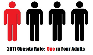
Today one in four American adults are obese.
The rate of obesity* has nearly doubled from about 15 percent of the population to more than 26 percent in less than two decades (1990-2010). Unfortunately, due to new survey methodology, the 2011 data released by CDC is not comparable with prior years.

In Colorado, which has the nation’s lowest rate (21%), more than one out of five adults are obese. Hawaii and Massachusetts are the only other states with rates below 23 percent.

The nation’s highest rates of obesity are in the southeast, with Mississippi (35%) topping the charts. Neighboring Alabama and Louisiana also exceed thirty percent.

So why are we getting fat?

There are a variety of factors at play in the rising obesity epidemic. Many sources show a correlation between obesity and commuting. The Federal Reserve and the USDA suggest that increased food consumption, particularly fast food, is the primary driver expanding America's waistlines.

New research, from Pennington Biomedical Research Center at Louisiana State University, digs into another trend - our economy - to understand the obesity epidemic. Using data on occupational patterns since the 1960s, coupled with weight data, and energy expenditure (i.e. calories burned) per day per occupation, they come to a startling conclusion: modern jobs make us fat. Specifically
"In the early 1960's almost half the jobs in private industry in the U.S. required at least moderate intensity physical activity whereas now less than 20% demand this level of energy expenditure. Since 1960 the estimated mean daily energy expenditure due to work related physical activity has dropped by more than 100 calories in both women and men."
Research from the Mayo Clinic, American Cancer Society, and have come to a similar conclusion - sedentary behavior leads to obesity. So the advent of desk jobs that require sitting for long periods of time may be a primary cause of rising rates of obesity.

One conclusion is certain, whatever the cause (or, more likely, causes) of obesity, the cost is too high to be ignored. Obesity can put people at higher risk for health problems including heart disease, diabetes, certain types of cancer (including breast and colon), high blood pressure, stroke, and other problems.

In addition to the health risk, these obesity-related diseases carry a hefty price tag. Healthcare costs for obese Americans were $1,429 higher than for persons of normal weight in 2008, according to research published in the journal Health Affairs. Today obesity-related diseases cost the nation an estimated $190 billion annually.

*According to the CDC, obesity is “defined as a Body Mass Index (BMI) of 30 or greater.BMI is calculated from a person's weight and height and provides a reasonable indicator of body fatness and weight categories that may lead to health problems. Obesity is a major risk factor for cardiovascular disease, certain types of cancer, and type 2 diabetes.