Showing posts with label fertility. Show all posts

Thursday, May 17, 2018

2017 births: lowest teen and young adult birth rate on record, rising rates at older ages

Highlights from the preliminary 2017 birth data

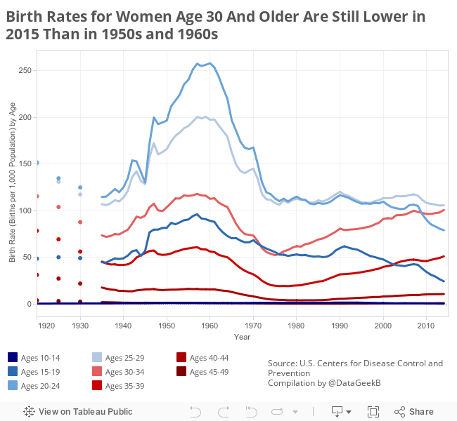
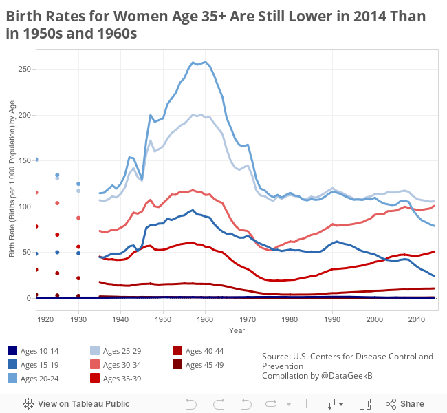
Birth rates for U.S. teens and early 20-something are at (another!) all-time low, and birth rates continue to rise at ages 40 and older.

Another important milestone is that, for the first time on record (2016), birth rates for ages 30-34 exceeded the rate for ages 25-29.

As a historical demographer, who has some experience with fertility and mortality rate trends over the past century (and the century before), and I can say with conviction that the trend toward higher birth rates at ages 30+ is not really new. Birth rates for women ages 35 and older are not higher now than ever. (They're not even higher now than they were in the 1950s and 1960s.) I would argue that, rising birth rates among those in their 30s and 40s is more a return to long-run historical norms than an aberration. (First births at older ages is a newer phenomenon, the rate at older ages is nothing new.)


The National Vital Statistics Reports, published by the U.S. Centers for Disease Control and Prevention, provide historical birth rate data by age of mother as far back as 1970. Earlier years are available, but must be compiled from a variety of other sources including the older, and often PDF-scan-only Monthly Vital Statistics Reports and the U.S. Statistical Abstract. From those sources I collected data as far back as 1920, with complete annual data from 1935-present. The historical birth rates (births per 1,000 women) are shown in the chart above.

I am happy to share the raw data upon request. Feel free to contact me for more information.

Friday, May 11, 2018

A note about measuring maternal mortality in Texas

You may (or may not) have heard that Texas has the highest maternal mortality in the nation, as a result of recent, dramatic increases in reported maternal deaths.

Or... it doesn't.

Researchers working for the state of Texas conducted a reassessment of the 2012 maternal mortality records. Researchers hypothesize that data entry errors led to records being inaccurately classified as maternal deaths. Knowing, as we do, that maternal mortality reporting has some considerable data accuracy challenges, this seems on the surface to be a good faith effort.

That said, I have concerns with the methods in the Texas analysis (explained in more detail below). In addition, while the authors do a nice job of stating the limitations of their work--data are not comparable to other years or other locations--the news media did exactly the opposite: compare to other places and times.

In 2012 Texas had 147 mortality records with an ICD-10 code indicating maternal mortality (codes A34, O00–O95, or O98–O99). Texas researchers used record matching and extensive death and health record review for the 147 maternal mortality coded deaths. Through this process the researchers identified birth or pregnancy status (within 42 days) at the time of death. This extensive review found a number of false positive results. Researchers then removed these deaths from the maternal mortality count. On this point, the analysis seems both reasonable and robust.

However, any analysis of data coding errors should clearly identify both false positives and false negatives. The search for false positives was (as described above) robust. The search for false negatives, on the other hand, used record matching alone. This may seem a minor point, but it is important because the robust methods used to find false positives were not similarly applied to find false negatives. Moreover, the record linkage process matched on SSN, name, and county of residence. Given their hypothesis of data entry errors, finding exact matches for all three of those open-ended data entry fields raises all sorts of possibilities for missed matches. In other words, the methods introduced potential bias in favor of finding false negatives and against finding false positives.

I recognize that individual case review for 9,000+ death records was probably implausible due to time and funding constraints. Still, more could easily have been done to try and identify false negatives. For example, they might have added a record linkage between all birth records and all death records.

And... Here's the piece that puzzles me most...

The Texas researchers posit (repeatedly) that the number of false positives is some artifact of newer data entry techniques. They state, specifically, that the upswing in the reported maternal mortality rate was driven by an increase in e-reporting:
"The percentage of death certificates submitted electronically increased from 63% in 2010 to 91% in 2012"
But... if electronic reporting was the problem, why wouldn't the problem have shown up in 2010 when 63% was already e-reported? Why do they think an incremental 28 percentage points was pivotal when first 63% was not? And, perhaps most importantly, why do they skip over 2011 when that year (not 2012) was the pivotal year for the increase in reported maternal deaths in Texas? (2011 was also the year TX began restricting family planning and reproductive health services.)
Texas Maternal Mortality Trend
Source: CDC WONDER, Multiple Cause of Death database, and natality database
Note: CDC reports 148 deaths in ICD-10 codes A34, O00-O95,O98-O99), TX reports 147


Friday, June 3, 2016

2015 data show historic low teen births, rising birth rate at older ages

Highlights from the preliminary 2015 birth data

Teen and early 20-something births are at (another) all-time low in the U.S., and birth rates continue to rise at ages 30 and older.

As a historical demographer, who has some experience with fertility and mortality rate trends over the past century (and the century before), and I can say with conviction that the trend is not really new. Birth rates for women ages 35 and older are not higher now than ever. They're not even higher now than they were in the 1950s and 1960s.

The National Vital Statistics Reports, published by the U.S. Centers for Disease Control and Prevention, provide historical birth rate data by age of mother as far back as 1970. Earlier data must be compiled from a variety of other sources including the older, and often PDF-scan-only Monthly Vital Statistics Reports and the U.S. Statistical Abstract.

From those sources I collected data as far back as 1920, with complete annual data from 1935-present. The historical birth rates (births per 1,000 women) are shown in the chart below.


Zeroing in on ages 35 and older, to show more detail on the chart scale, we see that birth rates are indeed higher in 2015 than they were in 1970. But we do not need to go back very much farther to find a time at which birth rates were higher than they are today: In the 1960s birth rates were higher for all ages 35-49 than they were in 2015.

If we go as far back as 1920, birth rates were nearly five times higher for women ages 45-49 than in 2015, nearly three times higher for ages 40-44, and fifty percent higher for ages 35-39 than they are at present.

In short, the phenomenon of increasing birth rates for women in their 30s and 40s is as much a return to historical patterns as a deviation from them.

To be clear, some pregnancy risks do increase with advanced maternal age:
"older age strongly increases a woman's chances of at least three untoward outcomes—namely, stillbirth, miscarriage, and ectopic pregnancy" (Stein and Susser 2000)
However, there is considerable evidence that socio-economic factors play the most important role in birth outcome - perhaps far outweighing the age effects (Cohen 2012, Azimi and Lotfi 2011, Stein and Susser 2000).

As for the current focus on trends in the past four decades, I suspect the ease of collecting data from 1970-present is partly the cause of the focus on a "huge" increase in childbearing at older ages... when, in reality, rates have fallen if you look back just 5 years more.

I am happy to share the raw data upon request. Feel free to contact me for more information.

Friday, April 8, 2016

Update: Births to "Older" Mothers Still Not News

This is an update of a post that originally appeared here in February 2013.

Sometimes "common knowledge" is not knowledge at all...

There has been considerable hand-wringing in the press over births to women over the age of 35. According to the Telegraph, older mothers are "driving up the birth defect rate." The New Republic suggests that older parents will "upend American society." And Slate, generally progressive, bemoans the "feminist fertility myth."

As a demographer, I am aware that birth rates in age groups 35-39, 40-44, and 45+ have been rising since the late 1970s for ages 35-39 and 45+, and since the early 1980s for the 40-44 set.

But as the granddaughter of a woman who birthed her youngest child when she was nearly forty, my skeptic antennae went up. My grandmother may have been a singular woman, but she was hardly a statistical aberration.

As a historical demographer, who has some experience with fertility and mortality rate trends over the past century (and the century before), and I can say with conviction that the trend is not really new. Birth rates for women ages 35 and older are not higher now than ever. They're not even higher now than they were in the 1950s and 1960s.


The National Vital Statistics Reports, published by the U.S. Centers for Disease Control and Prevention, provide historical birth rate data by age of mother as far back as 1970. Earlier data must be compiled from a variety of other sources including the older, and often PDF-scan-only Monthly Vital Statistics Reports and the U.S. Statistical Abstract.

From those sources I collected data as far back as 1920, with complete annual data from 1935-2010 (the most recent year for which complete data are available). The historical birth rates (births per 1,000 women) are shown in the chart below.

Zeroing in on ages 35 and older, to show more detail on the chart scale, we see that birth rates are indeed higher in 2010 than they were in 1970. Specifically, birth rates are 45% higher for ages 35-39, 26% higher for 40-44, and 40% higher for ages 45-49 in 2010 than in 1970.

But we do not need to go back very much farther to find a time at which birth rates were higher than they are today: In 1965 birth rates were higher for all ages 35-49 than they were in 2010.

If we go as far back as 1920, birth rates were nearly twice as high for ages 35-39, were three times higher for 40-44 year olds, and were more than 5 times higher for ages 45-49 than the rates in 2010.

In short, the phenomenon of increasing birth rates for women in their late 30s and 40s is as much a return to historical patterns as a deviation from them.

To be clear, some pregnancy risks do increase with advanced maternal age:
"older age strongly increases a woman's chances of at least three untoward outcomes—namely, stillbirth, miscarriage, and ectopic pregnancy" (Stein and Susser 2000)
However, there is considerable evidence that socio-economic factors play the most important role in birth outcome - perhaps far outweighing the age effects (Cohen 2012, Azimi and Lotfi 2011, Stein and Susser 2000).

As for the current focus on trends in the past four decades, I suspect the ease of collecting data from 1970-present is partly the cause of the focus on a "huge" increase in childbearing at older ages... when, in reality, rates have fallen if you look back just 5 years more.

I am happy to share the raw data upon request. Feel free to contact me for more information.

Monday, August 25, 2014

Is August now the best month for births?

For the past few years, I've been updating data about birth seasonality and noting that September is the most common birth month of the year.

This year I was updating the data to show 2012 and 2013 births, and discovered that...

August edged out September for the most popular birth month of the year!

There is a long-standing and clear pattern of "birth seasonality" resulting from a "seasonal cycle in fecundability" documented in the scientific literature. Holidays and long winter nights are partly to blame for more birthdays in the late summer and early fall, but human biology is at work as well.

In short, in the northern hemisphere, women are more likely to get pregnant in late fall and early winter than at other times of the year. As a result more births occur late summer and early autumn, a trend displayed clearly in the chart below. (In the southern hemisphere, the seasonal peak occurs about 6 months earlier.)

What's new in the past three years is that the peak seems to have shifted a few weeks from September into August.

In the chart below, blue represents lower numbers and red highlights peaks. The left panel is total births in a given month, and the right (as explained below) shows births per day in each month.

In the chart above, you may notice that March 2010 births appear high, but consider that February is a short month, and March is a 31-day month. August also has more days than neighboring month, September.

To correct for this, we can estimate the average number of births per day of the month. With this adjustment the seasonal pattern becomes even more pronounced. (See panel to the right, above.)

Correcting for the number of days per month shows September as the clear leader for births in 2008, 2009, and 2010, as it is in most years. But 2011 shows a slightly different pattern - August leads September by about 75 births per day.

And the August trend continued in 2012 and 2013! In fact, the August peak in 2012 is quite pronounced - more than 300 births per day higher than September.

The lower number of births in September 2011 may, or may not, be a consequence of a massive blizzard that shut down transportation along much of the east coast in December 2010... but the continuation of the pattern bears watching.

Friday, August 1, 2014

Casanova: Patient Zero

Sometimes historical demography requires overturning some unusual stones to get a sense of fertility patterns, family structure, public health, and other population dynamics in the past. My recent essay, published in Hektoen International Journal of Medical Humanities dives into a very unlikely source for demographic and public health information: Casanova's diary.
Giacomo Casanova, the infamous rake, is responsible for providing historians and anthropologists with a veritable treasure trove of historical health information. His life spanned from 1725 to 1798, and his memoir, Histoire de Ma Vie, recounts nearly every day of his life with meticulous detail, from the most basic breakfast (usually chocolate) to the most convoluted course of treatment for venereal disease (usually mercury). Far from being merely a smut-filled account of Casanova’s sexual conquests, the memoir provides modern readers with extraordinary insight into the world of public health, family planning, and the transmission and treatment of sexually transmitted disease in Europe in the eighteenth century... [continue reading]

Friday, October 25, 2013

Data link roundup (week of October 25, 2013)

The week's top data analysis links...
This week's theme: beginnings, endings, and how we spend the time between.


BABY BOOM / BABY BUST

Washington, DC is having a mini baby boom. Japan is experiencing a massive baby bust.


LIFE EXPECTANCY

The United States may have a high standard of living, but U.S. life exepctancy has not been keeping pace with other nations.


WASTING TIME?

With the advent of modern technology, we are spending more time online, but there are still only 24 hours in a day. So what do we give up to spend time on social media?
Source: Harvard Business Review
If you guessed "work" or "sleep," you're right. Based on data from the American Time Use Survey, researchers at NBER found that:
...each minute of online leisure time is correlated with 0.29 fewer minutes on all other types of leisure, with about half of that coming from time spent watching TV and video, 0.05 minutes from (offline) socializing, 0.04 minutes from relaxing and thinking, and the balance from time spent at parties, attending cultural events, and listening to the radio. Each minute of online leisure is also correlated with 0.27 fewer minutes working, 0.12 fewer minutes sleeping, 0.10 fewer minutes in travel time, 0.07 fewer minutes in household activities, and 0.06 fewer minutes in educational activities.


BEST CHART VIDEO OF THE WEEK

The Economist explains why most published research is wrong...


IN CASE YOU MISSED IT...

Saturday, September 14, 2013

Why is September a common birthday month?

Note: This post is adapted from last year's post and includes new data and analysis...

Do you feel like you're spending a small fortune on birthday cards every September? Is your Facebook feed alight with birthday reminders this month? Have you noticed more birthday party invitations arriving in the mail in recent weeks?

If you have noticed a spike, you are not alone. There is a clear pattern of "birth seasonality" resulting from a "seasonal cycle in fecundability" documented in the scientific literature. Holidays and long winter nights are partly to blame for more birthdays in September, but human biology is at work as well.

In short, in the northern hemisphere, women are more likely to get pregnant in late fall and early winter than at other times of the year. As a result more births occur late summer and early autumn, a trend displayed clearly in the chart below with birth data from the United States in 2010 and 2011. (Note: In the southern hemisphere, the seasonal peak occurs about 6 months earlier.)
Source: U.S. Centers for Disease Control and Prevention and author's calculations
In the chart above, you may notice that March 2010 births appear high, but consider that February is a short month, and March is a 31-day month. August also has more days than neighboring month, September.

To correct for this, we can estimate the average number of births per day of the month. With this adjustment the seasonal pattern becomes even more pronounced.
Source: U.S. Centers for Disease Control and Prevention and author's calculations
Correcting for the number of days per month shows September as the clear leader for births in 2010, as it is in most years. But 2011 shows a slightly different pattern - August leads September by about 75 births per day.

The lower number of births in September 2011 may, or may not, be a consequence of a massive blizzard that shut down transportation along much of the east coast in December 2010...

Thursday, August 22, 2013

Odds for betting on a birthday

Earlier today I tweeted about my maternity leave memo...
My maternity leave memo made finance staff laugh. What? Don't all moms incl a table w/ statistical likelihood of birth by week of gestation?
— Beth J (@DataGeekB)
The tweet generated as much commentary (and laughter) as the memo did, so here are some highlights of the data and answers to reader questions.

While plenty of practitioners will tell you that a "full term" birth is considered to be 40* weeks (280 days) of gestational age, the numbers simply don't bear that out. In recent years, both the median and the mode place a baby's most likely birth date at week 39 with a standard deviation of 7 to 9 days (depending on the source).
Source: CDC Births: Final Data for 2011, compiled by author
Note: Data shown here are for singleton births only, as multiple births have a higher likelihood of preterm delivery
I suspect the misconception about the most common length of pregnancy is a matter of old data.

In 1990 the median delivery date for a singleton** birth was in the 39th week, but the mode was 40. Perhaps most shockingly, in 1990 more than 10 percent of births occurred at 42 weeks or later!

Birth timing is not entirely predicted by biology. Medical interventions abound, as one in three singleton births are via cesarean delivery, so the distribution of births by gestational age is highly influenced by current medical standards.

Research from the mid-2000s suggests that mothers and infants are at higher risk of birth complications if pregnancy is allowed to extend beyond 42 weeks, so current practices encourage the use of medical interventions to ensure delivery before 42 weeks. This likely explains the substantial drop in post-term births between 1990 and 2011.

The data: Distribution of singleton births by gestational age
2011 2010 2006 2005 2000 1990
Under 28 weeks 0.6% 0.6% 0.6% 0.6% 0.6% 0.6%
28-31 weeks 1.0% 1.0% 1.0% 1.0% 1.0% 1.1%
32-33 weeks 1.2% 1.2% 1.3% 1.3% 1.2% 1.2%
34-36 weeks 7.3% 7.5% 8.1% 8.1% 7.3% 6.8%
37-38 weeks 25.7% 26.7% 28.9% 28.3% 24.4% 19.4%
39 weeks 30.1% 29.1% 26.2% 26.0% 24.9% 22.0%
40 weeks 19.9% 19.7% 19.4% 19.8% 21.9% 23.0%
41 weeks 8.6% 8.5% 8.6% 8.9% 11.3% 14.4%
42+ weeks 5.7% 5.6% 5.8% 6.0% 7.5% 11.5%
Source: CDC, National Vital Statistics Reports, Births: Final Data for 2011

Keep these stats in mind the next time you're betting in an office "guess the birth date" pool.

Have questions about the data?
Send me a message!


NOTES:
*Births prior to 37 weeks are considered to be pre-term (or premature). Births at or after 42 weeks are considered to be post-term. The wide range in the middle, from 37 to 42 weeks, truly reflects full-term gestation.

**Singleton births are births to an individual child, and excludes twins, triplets, or other multiple births.

Friday, August 2, 2013

Data link roundup (week of August 2, 2013)

The week's top data analysis links...
Last week we focused on mortality stats, so this week we're looking at the other end of the life course spectrum: babies and mommies.


PAMPERING A BABY (not as easy for some families)

New research published in the journal Pediatrics reveals a harsh reality for low-income families: diapers cost more than many low-income families can afford.

Lack of adequate diaper supply can result in negative outcomes for caretakers and children, including: family stress, anxiety, depression, and child health problems (e.g. increased risk of urinary tract infection).

Data were...
...derived from a cross-sectional study in 877 pregnant and parenting women. Mothers completed surveys on topics related to mental health, basic needs, and health care use. Logistic regression was used to estimate the relationship between diaper need and psychosocial correlates.
The study found that nearly one third of mothers in the survey reported a diaper shortfall. Hispanic women were significantly more likely to report diaper need than African American women.

(See also: diaper report summary on The Atlantic CITIES)


BREASTFEEDING BY THE NUMBERS

Breastfeeding rates have been climbing slowly but steadily for the past several years, according to new data released by CDC.

Rates of breastfeeding at 6 months are highest in Idaho, California, and Oregon according to the CDC's 2013 Breastfeeding Report Card. Rates in those three states exceed 70 percent. Rates are lowest, below 20 percent, in Mississippi.


SEX SELECTION AT BIRTH

New analysis from PRB highlights the problem of son-preference sex selection at birth in Armenia, Azerbaijan, and Georgia,


BEST CHART OF THE WEEK

Partly based on fertility and mortality trends, completely based on the latest United Nations population projections, The amazing, surprising, Africa-drive demographic future of the Earth, in 9 charts is worth a look.

Here is a sample (1 of the 9 interactive graphics):

Source: Max Fisher, Washington Post


IN CASE YOU MISSED IT...

Friday, July 5, 2013

Data link roundup (week of July 5, 2013)

The week's top data analysis links...
In light of the Texas filibuster (and subsequent second special session) this week's theme: facts and figures relating to reproductive rights

The Economist maps the current state of reproductive services available (or rather, not available), by county, in the United States.
Source: The Economist

Slate's new maps shows reproductive rights around the world including abortion laws, abortion restrictions, contraceptive laws (including hormone-based contraception, IUD, and condom laws), and much, much more...
Source: Slate

And last, but not least...
In a little-discussed, but highly relevant factor in the reproductive rights debate, The Economist charts the declining rate of abortions and abortion-related deaths since Roe v. Wade.
Source: The Economist

While correlation does not prove causality, the trend does provide a compelling case that legalization did not, in fact, increase abortions. What legalization did was reduce the number of maternal deaths.


BEST CHART OF THE WEEK

(See above...)

Thursday, June 13, 2013

6 things you need to know about the new U.S. population estimates

New 2012 population estimates from the U.S. Census Bureau show (among other things):

  • The Asian population grew fastest between 2011-12 (2.9 percent growth, or 530,000 people from 2011-12)
  • The Hispanic population grew most (1.1 million increase, or 2.2 percent, from 2011-12)
  • The White population only grew because of immigration (deaths exceeded births for the first time)
  • 6 more counties are "majority minority" (brings the total to 353 of the nation's 3,143 counties)
  • Maine is the oldest state, Utah is the youngest
  • Thanks to record low fertility rates, there are fewer children under the age of 5 than there were last year
To crunch the numbers yourself, see the Census Bureau's estimates page.

Friday, May 31, 2013

Data link roundup (week of May 31, 2013)

The week's top data analysis links...
This week's theme: fertility rates matter.


16 AND NOT PREGNANT

New data from CDC shows that teen birth rates continue to fall, and are at the lowest levels on record. According to the report:
"Teen birth rates fell at least 15% for all but two states during 2007–2011—the most recent period of sustained decline; rates fell 30% or more in seven states."
Declines were sharpest among Hispanic/Latina teens.
Source: U.S. Centers for Disease Control and Prevention

WHAT A DIFFERENCE A LITTLE ASSUMPTION MAKES

New global population growth projections by Stuart Basten, Wolfgang Lutz, and Sergei Scherbov show that a minor difference in fertility rate assumptions can make a major difference in long-range global population projections.

Like 30 billion people difference by the year 2200.

Let that sink in... then read their paper.


MASS MEDIA

In their paper (mentioned above) Basten, Lutz, and Scherbov briefly mention the factors that affect family size preference and fertility behavior. One factor they don't consider: television.

Rafael Pereira, of Urban Demographics, provides a roundup of the research on links between media exposure and reproductive behavior.


BEST CHART OF THE WEEK
... because rarely is my mind blown by the data contained in a single chart. (Really, you should read the Basten, Lutz, and Scherbov paper.)
Excerpted from Basten, Lutz, and Scherbov


Tuesday, February 19, 2013

Contrary to popular belief: Births to older mothers not at historic high

Sometimes "common knowledge" is not knowledge at all...

There has been considerable hand-wringing in the press over births to women over the age of 35. According to the Telegraph, older mothers are "driving up the birth defect rate." The New Republic suggests that older parents will "upend American society." And Slate, generally progressive, bemoans the "feminist fertility myth."

As a demographer, I am aware that birth rates in age groups 35-39, 40-44, and 45+ have been rising since the late 1970s for ages 35-39 and 45+ and since the early 1980s for the 40-44 set.

But as the granddaughter of a woman who birthed her youngest child when she was nearly forty, my skeptic antennae went up. My grandmother may have been a singular woman, but she was hardly a statistical aberration.

As a historical demographer, who has some experience with fertility and mortality rate trends over the past century (and the century before), I suspected the evidence of a "major shift" might be lacking, and I set out to prove it.

While the fertility trend of delayed childbearing and concomitant increase in birth rate for mothers age 35 and older is occurring in nations around the world, I will focus on data from the United States.

The National Vital Statistics Reports, published by the U.S. Centers for Disease Control and Prevention, provide historical birth rate data by age of mother as far back as 1970. Earlier data must be compiled from a variety of other sources including the older, and often PDF-scan-only Monthly Vital Statistics Reports and the U.S. Statistical Abstract.

From those sources I collected data as far back as 1920, with complete annual data from 1935-2010 (the most recent year for which complete data are available). The historical birth rates (births per 1,000 women) are shown in the chart below.
Sources: NVSR, MVSR, Statistical Abstract, and author's calculations

Zeroing in on ages 35 and older, to show more detail on the chart scale, we see that birth rates are indeed higher in 2010 than they were in 1970. Specifically, birth rates are 45% higher for ages 35-39, 26% higher for 40-44, and 40% higher for ages 45-49 in 2010 than in 1970.

Sources: NVSR, MVSR, Statistical Abstract, and author's calculations
But we do not need to go back very much farther to find a time at which birth rates were higher than they are today: In 1965 birth rates were higher for all ages 35-49 than they were in 2010.

If we go as far back as 1920, birth rates were nearly twice as high for ages 35-39, were three times higher for 40-44 year olds, and were more than 5 times higher for ages 45-49 than the rates in 2010.

In short, the phenomenon of increasing birth rates for women in their late 30s and 40s is as much a return to historical patterns as a deviation from them.

To be clear, some pregnancy risks do increase with advanced maternal age:
"older age strongly increases a woman's chances of at least three untoward outcomes—namely, stillbirth, miscarriage, and ectopic pregnancy" (Stein and Susser 2000)
However, there is considerable evidence that socio-economic factors play the most important role in birth outcome - perhaps far outweighing the age effects (Cohen 2012, Azimi and Lotfi 2011, Stein and Susser 2000).

As for the current focus on trends in the past four decades, I suspect the ease of collecting data from 1970-present is partly the cause of the focus on a "huge" increase in childbearing at older ages... when, in reality, rates have fallen if you look back just 5 years more.

I am happy to share the raw data upon request. Feel free to contact me for more information.

Thursday, February 14, 2013

Love and marriage

In honor of St. Valentine...

MARRIAGE TRENDS

According to recent news, the longest-married couple in the United States tied the knot more than 80 years ago.

Valentine image source
While this may be an unusual feat, marriage duration has (on average) increased in recent years. This trend persists despite the fact that marriage rates are declining.

80 percent of marriages last at least 5 years, and 68 percent last 10 years or more, according to data compiled by the U.S. Centers for Disease Control and Prevention based on the National Survey of Family Growth (2006-2010).

This is an increase from the 2002 survey, in which 78 percent of marriages last at least 5 years and two thirds last 10 years or more.


OTHER VITAL EVENTS

According to many news sources, condom sales are highest in February (in the US and in India, for example). However, a National Institutes of Health study shows that increased condom sales do not necessarily translate to increased condom usage.

Nielsen research notes a corollary trend: an increase in sales for home pregnancy tests in March. From a February 2008 news release published by Nielsen:
First Comes Love, Then Comes...
Perhaps as a result of Valentine’s Day romance, more pregnancy and infertility test kits are sold approximately six weeks after Valentine’s Day than at any other time of the year. Consumers spend more than $15 million*on pregnancy and infertility test kits during the second, third and fourth weeks of March, with the third week of March ranking number one** in sales.
Notes: *Three weeks ending March 24, 2007 showed total sales of $15.4 million for pregnancy and infertility test kits in U.S. food, drug and mass merchandiser stores, including Wal-Mart. **One week ending March 24, 2007 showed total sales of $5.2 million for pregnancy and infertility test kits in U.S. food, drug and mass merchandiser stores, including Wal-Mart.
Despite Nielsen's sensational headline, births are actually highest in late summer and early autumn, as a result of pregnancies in late autumn and early winter of the prior calendar year. This trend, known as a "seasonal cycle in fecundability" is well documented in the scientific literature.

Monday, January 7, 2013

Population Profile: Alabama

POPULATION GROWTH IN ALABAMA:

Population in 2010: 4,779,735
Population in 2000: 4,447,100
Growth rate 2000 to 2010: 7.5%
Sources: U.S. Census Bureau, Census 2010 and Census 2000

Place of Birth: Percent of resident population born in the state of Alabama:
Source: U.S. Census Bureau, American Community Survey 2007-2011

AGE STRUCTURE:

Median age in 2010: 37.9

Alabama Age Structure in 2010:
Source: U.S. Census Bureau, Census 2010 and author's calculations

PUBLIC HEALTH:

Birth rate: 12.4 per 1,000 population (compared with national rate 12.7)
Fertility rate: 61.8 per 1,000 women age 15-44 (compared with national rate 63.2)
Infant mortality rate: 8.28 per 1,000 live births (compared with national rate 6.39)
Sources: U.S. Centers for Disease Control and Preventionpreliminary birth data for 2011final death data for 2009

Life expectancy: 75.2 years (compared with national 78.6)
Source: Kaiser Family Foundation state health facts 2007

Adult obesity rate in 2011: 32.0 percent
Source: U.S. Centers for Disease Control and Prevention, Behavioral Risk Factor Surveillance System

OTHER FACTS:

Only 3.4 percent of the population in Alabama is foreign-born, compared with a national average of 12.8 percent.
Source: U.S. Census Bureau, American Community Survey 2007-2011

Despite the holiday's association with New Orleans, it is Mobile, Alabama that gets credit for hosting the first Mardi Gras celebration in North America in 1703.
Sources: CNN and History Museum of Mobile

Tuesday, December 11, 2012

Nation's largest metros growing, but reasons vary

America's biggest metropolitan areas are growing, but for very different reasons, according to a new report from the U.S. Census Bureau.

Among metropolitan areas of 2.5 million people or larger, only Detroit lost population between July 1, 2010 and July 1, 2011. The other twenty large metro areas all saw population growth. However, drivers of growth varied widely among metropolitan areas.
Source: U.S. Census Bureau

DRIVERS OF GROWTH:

Population change occurs because of births, deaths, and migration. Births and deaths, collectively, are referred to as "natural increase."

At the state, county, and local level, migration can measured in a variety of ways, but is often estimated in terms of net international migration (those moving into, or out of, an area from abroad) and net domestic migration (those moving into, or out of, an area from another area within the same nation).

NET DOMESTIC OUT MIGRATION IN THREE LARGEST METROS:

In the nation's three largest metropolitan areas, New York, Los Angeles, and Chicago, population grew as a result of births, longer life expectancy, and international migration.

However, net domestic migration estimates show that more residents moved out of these areas to other parts of the United States than moved into these areas between 2010 and 2011.

DON'T MESS WITH TEXAS:

The largest metropolitan areas in Texas, however, showed an entirely different pattern, acting as magnets for migration from other parts of the United States.

The Dallas-Fort Worth and Houston metro areas both grew by more than 100,000 during the year with 20 percent or more of that growth coming from net domestic migration.

SUNSHINE STATE:

Miami and Tampa, Florida's largest metropolitan areas, were also net-attractors of residents from other parts of the U.S. Miami showed fairly even population growth across all categories (20,400 natural increase, 35,200 international migrants, 36,200 domestic migrants) for net population growth of more than 92,000.

While Tampa attracted more than 27,000 domestic migrants, net international migration was less than 7,000, and an aging population resulted in net natural increase of only 2,300, the lowest of all 21 large metropolitan areas in the report.

GOLDEN STATE:

As noted above, more residents moved out of the Los Angeles metro area than moved in between 2010 and 2011. However, other large metros in California fared better. As a result of net domestic in-migration San Francisco gained 5,900, Riverside-San Bernardino gained more than 15,000, and San Diego grew by 800.


Methodology and Source Notes:
The figures shown above are from the U.S. Census Bureau Population Estimates (vintage 2011). Additional information on patterns of migration can be found in the Current Population Survey report on geographic mobility.

Friday, December 7, 2012

Data link roundup (week of December 7, 2012)

The week's top data analysis links...

METRO COMPARISONS

A new map tool from Brookings shows the relative economic strength and rate of recovery for metropolitan areas around the world, and includes data from 1993-2012.


20 YRS OF TXT

The Economist reminds us that this week text messaging turned 20. (Another year and drunk-texting is legal?)
Source: The Economist


CAN'T TEXT AND DRIVE

RCLCO delivers more evidence that Millennials are less auto-centric than other generations of Americans.

The study authors surveyed residents in the 20 largest metropolitan in the U.S. to "gauge current attitudes toward auto use and ownership." According to study authors:
The survey results show significant continued devotion to the auto—over 60% of all respondents answered affirmatively when asked whether they own and need a personal automobile and could not live without it—but a substantial minority expressed a willingness to consider alternatives to auto ownership, such as relocation to other locations with improved public transit and car sharing.  Not surprisingly, the Gen Ys (born since the early 1980s), with their now well-known urban preferences, show considerable interest in these ideas. From a real estate development perspective, the impact of less auto usage, and by extension less on-site parking, can have a dramatic impact on development costs. Results from the RCLCO survey indicate that significant generational differences exist in attitudes toward car ownership. For example, Gen Y respondents indicated that they prefer not to own a car at a much greater rate than their counterparts in other generations—32% of responding Gen Ys do not own a car and do not need one, because they use public transit and/or alternative transportation. This is approximately twice the rate for Gen X and over three times the rate for older generations.
(Author's note: I suspect texting is the driving force behind this shift.)


BEST CHART DATA OF THE WEEK

This week the U.S. Census Bureau released 5-year American Community Survey data for 2011. The FactFinder2 application offers online mapping capabilities, as illustrated by the Florida and New York teen birth rate maps shown below.
Source: Author's compilation of data from the FactFinder2 mapping tool
The maps represent the proportion of females age 15-19 who report having a birth in the past 12 months when questioned during the 2007-2011 ACS survey period.

Saturday, December 1, 2012

Bloomberg gets birth headline wrong

In an article published yesterday, and based off of birth rate trends reported by the Pew Research Center, Bloomberg Businessweek reported that U.S. births are at their lowest since 1920.
Source: Bloomberg Businessweek

Not so fast...

The Pew analysis, based on National Vital Events records and American Community Survey data, found that the birth rate is at its lowest point on record in the United States. Pew's authors write:

The overall U.S. birth rate, which is the annual number of births per 1,000 women in the prime childbearing ages of 15 to 44, declined 8% from 2007 to 2010. The birth rate for U.S.-born women decreased 6% during these years, but the birth rate for foreign-born women plunged 14%—more than it had declined over the entire 1990-2007 period.1 The birth rate for Mexican immigrant women fell even more, by 23%.

Final 2011 data are not available, but according to preliminary data from the National Center for Health Statistics, the overall birth rate in 2011 was 63.2 per 1,000 women of childbearing age. That rate is the lowest since at least 1920, the earliest year for which there are reliable numbers.

The 2011 birth rate, indeed, appears to be the lowest on record. However, the U.S. population is three times larger in 2011 than it was in 1920 (105.7 million in 1920 compared with 311.0 million on April 1, 2011).

As a result of the two combined demographic forces, a growing population and a declining birth rate, the total number of births is still higher in 2011 (3,953,600) than it was in 1920 (2,777,000).

The chart, from CDC, illustrates this point. The darker blue line represents the total number of births, while the lighter colored line represents the rate.
Source: CDC
Births and the birth rate are not one and the same.

This might seem like an unimportant nuance, but consider the implications for school planning if the public is led to believe that five years from now there will be fewer children in Kindergarten than there were during World War I...

Friday, September 14, 2012

Data link roundup (week of September 14, 2012)


The week's top data analysis links...

NO END OF MEN

In an article I published on Examiner, I debunk the data Hanna Rosin uses to make the case that there is an "End of Men."


LOWEST TEEN BIRTH RATE ON RECORD

New data released by the CDC shows that in 2010 the teen birth rate fell to its lowest recorded level in U.S. history. (Records for all births go back to the 1920s. Records for teen births are reported from 1960.)
Source: CDC
A brief summary of the CDC report can be found here.